
Design systems by Endi Saliaj
A design system is one shared kit of colours, type, icons and components, in Figma and in code. With it, every new screen is faster to make and looks like the rest. I built the LanderLab design system: more than 50 components.
The real win is not a nice Figma file. It is designers and developers using the same names for the same parts, so a new feature is mostly putting known pieces together. On LanderLab that made the development team 72% more efficient.
Good for Products that grew fast and now look a bit different on every screen.
What you get
- An audit Every colour, font size and button you have today, in one place.
- Foundations Colours, type, spacing, icons and light and dark mode as Figma variables.
- Components Buttons, inputs, cards, menus, popups and badges, with all their states.
- Patterns Empty states, forms, tables and onboarding, built from the components.
- Docs for the team How and when to use each part, named the same as in the code.
- 50+components in the LanderLab system
- +72%development team efficiency
The work
- Add panelElementsSectionsSearch for element
Structure
ColumnsBest for responsive layoutsHorizontal stackArrange items in a rowVertical stackArrange items in a columnBasic
ButtonSend people to your offerLink textA link inside your textTypography
HeadingTitles for main sectionsParagraphBlocks of rich text - Text styling
Text styling
AaRobotoAaMedium16pxMore typography settings
- Context menuCopy⌘ CPaste⌘ VDuplicate⌘ DSelect parent⌘ ↑
Open image in new tabAdd class
Delete⌫ - Spacing
Layout
Margin 0020100Padding 20202020 - Align items
Align items
OrientationDistributeCenterAlignGap20px - AI actionsWhat do you want to generate?Rewrite textMake it shorterMake it longerFix spelling and grammar
- Element properties
Div properties
Classes
Section 1 Hero Add class…Element ID
#ll-section1Custom attributes
aria-label="pricing" - Colour picker
Colour picker
#257CFF100%
LanderLab design system· LanderLab
The editor’s panels and menus from the LanderLab UI kit, rebuilt in code.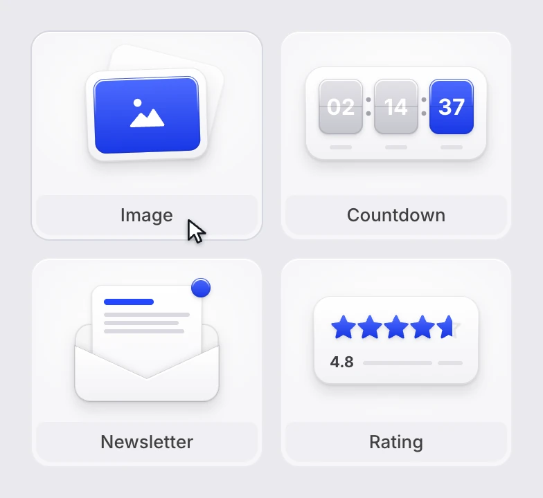
Element illustrations· LanderLab
Twenty-two small drawings for the LanderLab editor, one for every element you can drag onto a page.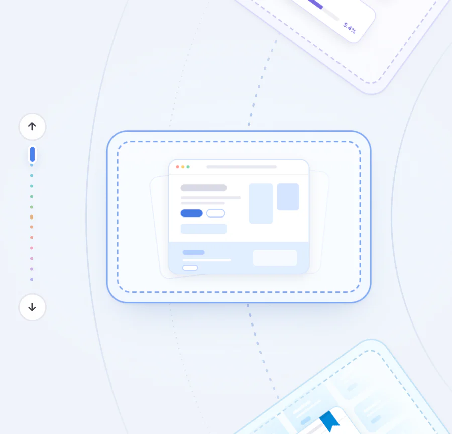
Empty states· LanderLab
Thirteen LanderLab empty states on a turning wheel, each drawn in code and moving the way its screen works.


-
 Publisher King 12 June 2025
-


 DNS Wizard 12 June 2025
-
 Integration Master 05 March 2026
-


 The Creator 05 March 2026
-
 Lead Collector 05 March 2026
-
 Team Player 05 March 2026
Achievement badges· LanderLab
The badges LanderLab users earn as they build, publish and grow: the reward system inside the product.How it goes
- 01
Audit
Collect what exists and find the doubles.
- 02
Foundations
Colour, type, spacing and icons first.
- 03
Components
The parts every screen is made of, with every state.
- 04
Adopt
Move real screens onto the system, with the developers.
Questions
- Do you start from scratch?
- Rarely. Most systems start from what the product already has, cleaned up and named.
- Does it work in dark mode?
- Yes. Colours are set as variables with a light and a dark value.
- Where are you based?
- I live in Tirana, Albania, and work with teams in Albania and abroad, remotely, in English or Albanian.
Start a project
Tell me about your project
Send an email to endisa1999@gmail.com with a few lines: what you do, what you need, links to what you have now, and when you need it.